Please note: Mobile Theme was deprecated in March, 2020. The following information is being kept for posterity.
Howdy Jetpackers,
You might already be familiar with the Mobile Theme module: it displays your content in a clean, uncluttered interface for phones, making it easy visitors to access your latest post on the go.
If you have enabled the Mobile Theme module, your mobile visitors see a fresh blue home page:

But did you know you could customize the look of this Mobile Theme? With a few simple changes, bring your site’s mobile experience more in line with the full-screen version. Your can customize both the kinds of content that appear on your mobile home page and the colors and header.
Customize the contents of your homepage
The Mobile Theme includes two home page options:
- You can choose to display excerpts or full posts on the home and archive pages.
- You can show a promo for WordPress mobile apps in your footer.
Access these options by clicking on Configure under the Mobile Theme module in the Jetpack menu.
Change the look of the theme
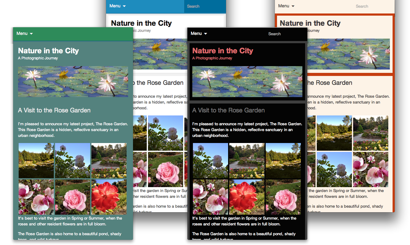
It does use a lovely shade of blue, but what if the Mobile Theme could use the same color scheme as your desktop theme? The same header and background? Luckily, you can do just that — and more!
We’ll go through three ways to customize the Mobile Theme. Depending on what you want to do and how comfortable you are with code, you can make changes through the Customizer, with CSS, or with actions and filters.
Through the Customizer
If your theme features a Custom Background or a Custom Header, the images or colors will automatically be ported over to the Mobile Theme, no additional work needed.
To get started with headers and backgrounds, go to Appearance >> Themes in your dashboard, and click “Customize”:
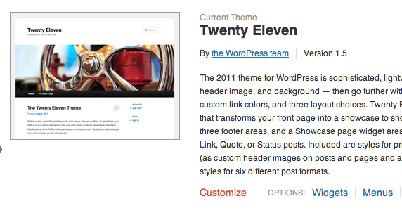
If your desktop theme supports them, you’ll be able to specify a custom header or a custom background for your desktop and Jetpack’s Mobile theme.
Through the Custom CSS Module
Jetpack includes a module named Custom CSS that allows you to add your own CSS code without having to edit your theme stylesheet. The custom CSS editor is available under Appearance >> Edit CSS in your dashboard.
You may have used it to make changes to your desktop theme, but it also includes a Mobile-compatible option:

If you choose the mobile compatible option, all your custom CSS will also apply to the Mobile theme.
You can also use CSS to make changes that are specific to the Mobile theme. To do that, use the .mobile-theme class to target only the Mobile theme.
Through actions and filters
Jetpack’s Mobile theme, like other themes and plugins, uses actions and filters to add data and features to your site. If you want to remove or edit some of the mobile theme’s functions, you can build a small plugin.
Here is a small example: we will add post authors’ Gravatar images before each post on the mobile home page. To do this, we’ll create a new function named jetpackme_author_image, and we will hook that function into the the_content filter.
// Check if we are on mobile
function jetpackme_is_mobile() {

    // Are Jetpack Mobile functions available?
    if ( ! function_exists( 'jetpack_is_mobile' ) )
        return false;

    // Is Mobile theme showing?
    if ( isset( $_COOKIE['akm_mobile'] ) && $_COOKIE['akm_mobile'] == 'false' )
        return false;

    return jetpack_is_mobile();
}

// Let's add the post author's Gravatar image, but only if we're on a mobile device
function jetpackme_maybe_add_filter() {

    // On mobile, and on the home page?
    if ( jetpackme_is_mobile() && is_home() ) {
        add_filter( 'the_content', 'jetpackme_author_image' );
    }
}
add_action( 'wp_head', 'jetpackme_maybe_add_filter' );

// Build the function
function jetpackme_author_image( $content ) {

    global $post;
    $avatar = get_avatar( $post->post_author );

    return $avatar . $content;
}
You could use a similar method to add, edit, or remove features from the Mobile theme. (If you do, please let us know about the cool things you built with the Jetpack Mobile Theme!)
Is there anything else you’d like to know about Jetpack’s Mobile Theme? Is there a particular Jetpack module you’d like to learn more about? Let us know!
 Jetpack
JetPack is turning into a wonderful little add-on. Keep going and it’ll make it to the must-have list!
LikeLike
What we really need are mobile-specific widget areas… please, thank you!
LikeLiked by 1 person
You could create mobile-specific widget areas by creating a new sidebar in a small plugin, and hooking it into the Mobile Theme as I explained in the post.
Do not hesitate to let me know here or in the forums if you need any help with that!
LikeLike
I appreciate all you guys do… but I comment as a publisher, not a theme or plugin designer. With limited time, my focus is on writing. Wish Automattic charged in some way in exchange for development. Would also be nice to pull together a team of publishers for feedback on our needs, which might be more meaningful to all than the annual survey.
LikeLike
You’re always welcome to post in the forums or send us an email if you have remarks or suggestions about Jetpack. We’re always happy to receive feedback, and we can help you if you need to make small changes like that extra widget you mentioned above.
LikeLiked by 1 person
Mobile widget area, I like that Thanks !!
LikeLike
Is there a way to disable mobile devices from auto-zooming when tapping the search box? In fact, it would be great if we could just disable zooming altogether.
LikeLike
Could you let me know which mobile device you’re using, so I can try to reproduce?
Thanks!
LikeLike
iPhone. It zooms on my 4S and my friend’s iPhone 5.
LikeLike
Thanks! I just tested it, and it does zoom a bit indeed, to help you see what you’re typing. I took note of your feedback, and we’ll see if we can disable this function in a future update.
LikeLike
This might be a start: http://davidwalsh.name/zoom-mobile-browsers
LikeLike
We have now solved the issue. The fix ill be included in the next Jetpack release.
LikeLike
Just so fantastic.
LikeLike