This article covers the two filter container blocks available in Jetpack Search Blocks, Filters and Collapsible Filters, and the utility blocks that manage filter state: Active Filters and Clear Filters. You’ll learn when to use each container and how to configure them. For individual filter types like Category, Tag, and Date, see the filter types article.
This feature requires Jetpack Search. For setup instructions and an overview of all available Search Blocks, see the overview and setup article.
What are Filters
Filters let visitors narrow search results by attributes like category, tag, author, post type, or date. When a visitor selects a filter value, the search results update immediately to show only matching content.
In Jetpack Search Blocks, each filter is its own block. You place filter blocks inside a container block (either Filters or Collapsible Filters), and the container handles the layout. The filter blocks handle the logic, what visitors can filter by and how the options are displayed.
Jetpack Search includes several filter types: Checkbox Filters for attributes like Category, Tag, Post Type, and Author, and a date-based filter for narrowing results by year or month. Each filter type and its settings are covered in the filter types article.
How to add Filters
To add filters to your search page, insert one of the two container blocks into your page layout:
- Open the page or template where your search results appear.
- Click the block inserter (+) and search for “Filters” or “Collapsible Filters.”
- Insert the container block where you want the filters to appear.
Both containers come with a default set of filter blocks already inside, so you’ll have a working filter setup as soon as you add one. From there you can rearrange, remove, or add more filter blocks to match what your visitors need.
For details on choosing between the two containers and what each one includes by default, see Filter Containers below
Filter Containers
Jetpack Search Blocks include two container blocks for holding filters. Both work with the same set of filter blocks inside, but they present filters differently:
- Filters — a vertical sidebar-style panel that keeps filters visible alongside your search results at all times.
- Collapsible Filters — a compact button that opens a popover panel when clicked, keeping filters out of the way until a visitor needs them.
Both containers support the same Checkbox Filter variations (Category, Tag, Post Type, Author, and more). The one exception is Filter by Date, which is only available inside the Filters block.
Filters
The Filters block is a vertical container that holds individual filter blocks in a sidebar-style layout. Visitors use the filters inside it to narrow search results by category, tag, date, author, post type, or any custom taxonomy.
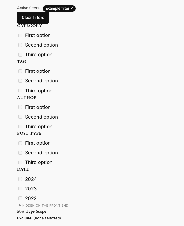
When you first add the Filters block, it comes with the following inner blocks already included:
- Active Filters — labels showing currently applied filters. Clicking one removes it.
- Clear Filters — a button that removes all active filters at once.
- Filter by Category — checkbox list for the WordPress Category taxonomy.
- Filter by Tag — checkbox list for the WordPress Tag taxonomy.
- Filter by Author — checkbox list of post authors.
- Filter by Post Type — checkbox list of content types.
- Filter by Date — year-based date buckets, configurable to month.
- Post Type Scope — a silent constraint that limits which post types are searchable. It renders nothing for visitors.
You can remove, rearrange, or duplicate any of these.
Collapsible Filters
The Collapsible Filters block renders a compact button that opens a popover panel containing filter blocks. It keeps the filter interface out of the way until a visitor needs it. When one or more filters are active, a badge on the button shows how many are currently applied. Clicking outside the panel or pressing the Escape key closes it.
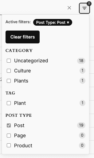
When you first add the Collapsible Filters block, it contains:
- Active Filters — labels showing currently applied filters.
- Clear Filters — a button that removes all active filters.
- Filter by Category — checkbox list for the WordPress Category taxonomy.
- Filter by Tag — checkbox list for the WordPress Tag taxonomy.
- Filter by Post Type — checkbox list of content types.
The default set is smaller than the Filters block to keep the popover compact. Filter by Date is not available inside Collapsible Filters. If you need date filtering, use the Filters block instead.
Adding and removing filters
To add a filter, click the + icon inside the container block and choose from any available filter block. Each Checkbox Filter variation (Category, Tag, Post Type, Author, and others) appears as its own card in the inserter, along with Filter by Date, Active Filters, Clear Filters, and Post Type Scope.
You can add multiple Checkbox Filter variations in the same container, for example, Filter by Category, Filter by Tag, and Filter by Author all together.
To remove a filter, select it and press Delete or use the block options menu.
For details on each filter type and its settings, see the filter types article.
Filter state blocks
Filter state blocks give visitors control over the filters they’ve applied. They go inside either the Filters or Collapsible Filters container and are included by default in both.
- Active Filters — shows the currently applied filters as dismissible labels.
- Clear Filters — a button that removes all active filters at once.
Active Filters
The Active Filters block shows visitors which filters they currently have applied, displayed as dismissible labels. Clicking a tag removes that specific filter and updates the results immediately.
When one or more filters are active, a row of labels appears, one per selected filter value (for example, “Category: News” or “Author: Jane”). When no filters are applied, it is hidden.
On WooCommerce sites
When WooCommerce is active and a Filter by Price block is on the page, the Active Filters block also shows a dismissible price-range chip alongside the standard filter labels. The currency symbol is inherited from the store’s WooCommerce currency setting.
The chip label adapts to the shopper’s selection:
- Both minimum and maximum set: “Price: $10 – $50”
- Minimum only: “Price: $10+”
- Maximum only: “Price: Under $50”
Clear Filters
The Clear Filters block adds a button that removes all active filters at once, returning search results to their unfiltered state. It includes the following settings:
- Button label is the text displayed on the clear button. It defaults to “Clear filters” if left blank. You can customize it to match your site’s style, for example, “Reset,” “Remove all filters,” or “Start over.”
- Hide when no filter is active is checked by default. The button only appears once a visitor applies a filter. Uncheck it to keep the button visible at all times.
Still need help?
Please contact support. We’re happy to advise.
 Jetpack