Early in 2014, we felt that Jetpack needed a new identity. The Jetpack team is continuously developing new features and it’s one of our top priorities for the future of WordPress. We knew that a strong brand would help evolve Jetpack into a better product.
The original logo was conceived in 2011, right before Jetpack’s launch at SXSW. Since then, Jetpack has become a top three plugin and a major part of the WordPress ecosystem. Millions of WordPress sites rely on Jetpack’s features. This is the next chapter for Jetpack, and the new brand will serve as a strong foundation for its future.
Initially, we explored literal jetpack imagery because of the strong brand equity of the previous logo.
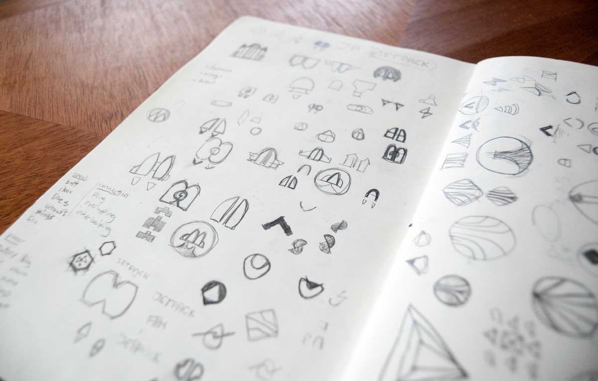
Early jetpack sketches
We also explored several other literal concepts, but we felt we needed something more emblematic that could stand on its own. The new logo’s basis came from simply constructed geometric shapes in early abstract sketches:

Early abstract sketches
Several ideas made it past the sketching phase, but none of them quite hit the mark.
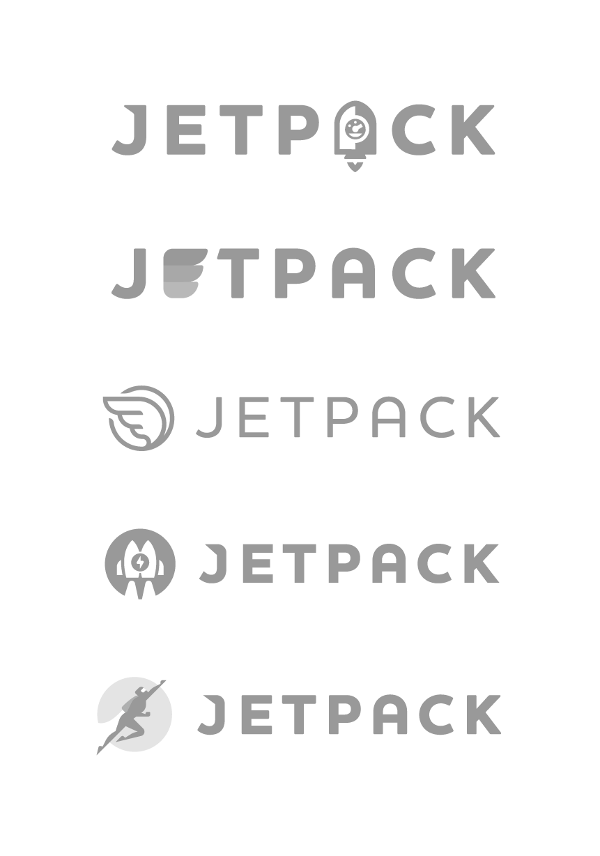
Any of these would have been fine solutions, but we didn’t think they were representative of Jetpack. Using wings or feathers didn’t feel quite right, and some of the others were too whimsical and playful. The new logo is simple and strong and it represents the bridge between WordPress.org and WordPress.com: lightning fast and powerful.
Final logo
We really liked the illustration of the flying character, so we decided to use it as an additional branding element. A mascot for Jetpack!

Jetpack illustration

Jetpack stickers and Scout Books
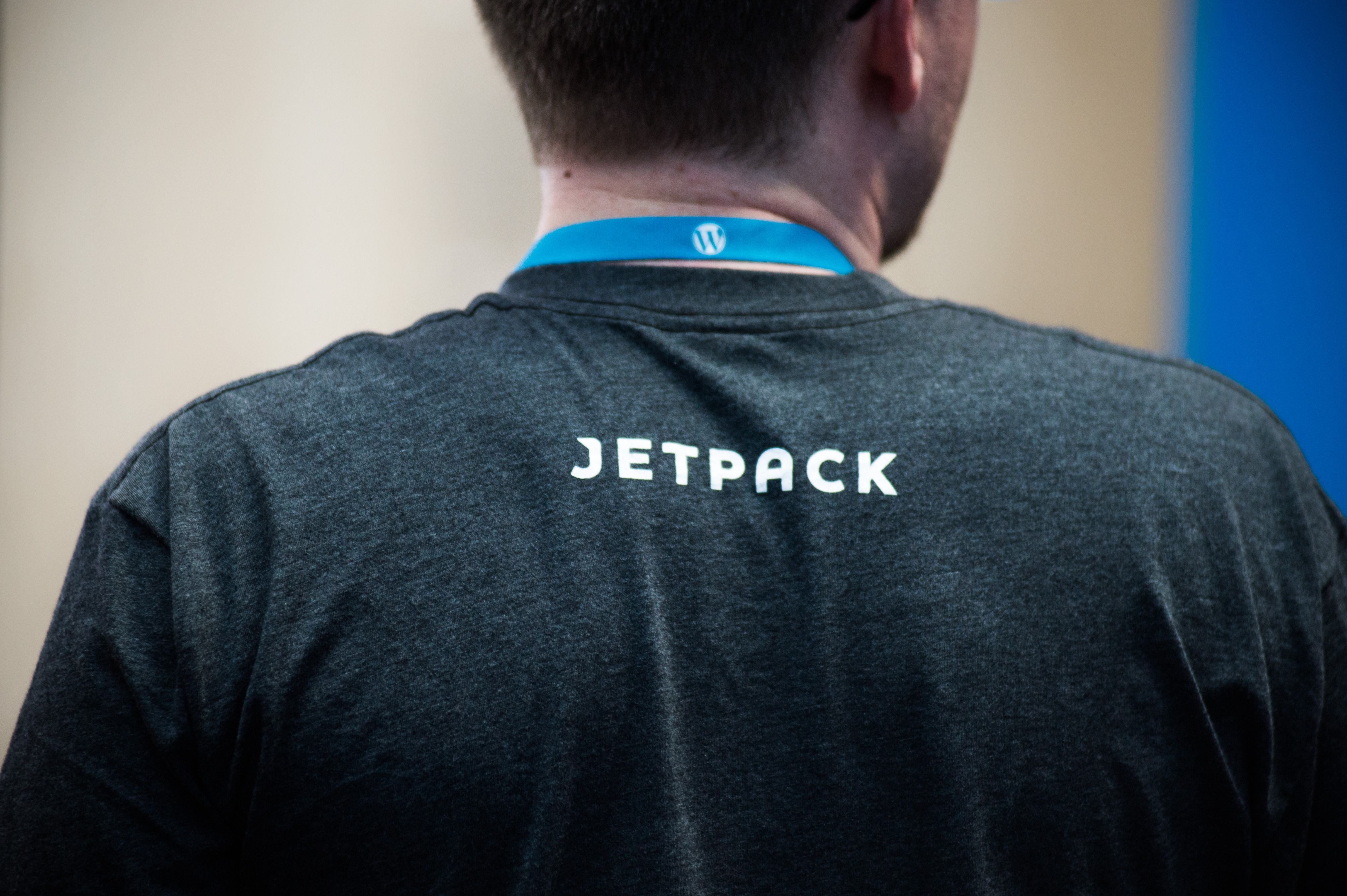
Jetpack shirt
Jetpack sticker
If you’re going to be at WordCamp Philly, WordCamp Denver, or WordCamp Europe this month, be sure to visit Jetpack’s booth and help yourself to some swag with the new logo.

Great evolution and thank you for sharing. Now, could you please direct us NON Techies to the tutorial, ;D to help me with my Webpage PLEASE, social media numbers, making sure all the old content comes through from WordPress which I have done 4 times. We put out a great product and thank you for your genius!!! Cheers
LikeLike
I’m not sure all of this can be covered in a single tutorial, but if you have specific questions feel free to send us an email, we’ll be happy to help!
LikeLike
LOVE IT!!!
LikeLike
Jetpack logo is one of the most successful of all WordPress logos, in general being a beautiful example of creative, modern and very communicative graphic design. Looking at the history of development means the refinement achieved. Congratulations , good job !
LikeLike
Thank you!
LikeLike
I didn’t realize that it was just a play on geometric shapes from a design. Is the new logo not based on the letters J and P? My whole world is upside down now!
LikeLike
Good eye! The shapes are a very subtle reference to the letters J and P.
LikeLike