As a business owner, you have an endless to-do list and managing your website probably falls to the bottom of the list. Dealing with clients, working with employees, creating marketing plans, managing inventory, and calling vendors seem more immediate than editing a blog post or updating a plugin.
But managing your website and keeping it updated play a critical role in the success of your business. What happens if you neglect it?
Jetpack 8.1 is now available for download. Our first release of the new decade is a general maintenance release that fixes several bugs and improves compatibility between Jetpack, PHP 7.4, and the newest default WordPress theme, Twenty Twenty.
A successful website requires consistent management and upkeep, especially if you have multiple users and contributors. But if you’re as busy as most entrepreneurs, you may not have the time to keep track of every action on your site.
Continue reading → How the Jetpack Activity Log Helps You Manage a WordPress Site
Since the advent of the smartphone, it’s rare to find a website that isn’t optimized for use on mobile devices. Managing your website via your phone or tablet, however, is still a fairly new concept.
Managing your site from a mobile device makes running a business more convenient. It’s beneficial for photographers who want to upload photos from their smartphones, bloggers who are inspired by their surroundings on-the-go, ecommerce sellers who want to keep tabs on their site stats, and any other type of website owner.
Let’s take a look at a few ways you can manage your WordPress site from your mobile device, and some tips for getting the most out of your mobile experience with Jetpack.
Continue reading → Tips for Managing Your Site from Your Mobile Device
We’re happy to announce some significant improvements for Jetpack users in the official WordPress App for Android, available now in the Google Play Store.
This update brings to Jetpack users the same features and functionality that WordPress.com site owners have come to expect on Android, including, among others, People Management, Site Settings, and Site Icons.
We’ve also delivered a full re-write of our networking code on Android, which means you’ll also benefit from all-around performance improvements even to features you’re already familiar with, like your Site Stats.
To get started, install Jetpack on your WordPress site (if it isn’t already) and install the WordPress App on your Android device. Then log in with your WordPress.com account to manage all your WordPress sites from one place.
We’re really excited about these enhancements and hope Android users will be too! We look forward to continuing to improve your WordPress experience, no matter what device you use (Jetpack is also supported on iOS) and as always we welcome your feedback and questions.
Pro Tip:Personal plan customers benefit from priority support and faster assistance.
Posted inReleases|TaggedAndroid, apps, Mobile|Comments Off on Full Android Support for Jetpack Sites
Making your website mobile-friendly is becoming as important as having good content: over 75% of Americans now access the internet on both desktop and mobile devices, and the numbers of users who solely use a mobile device or tablet is steadily on the rise. A mobile-friendly site also helps attract new visitors; in April 2015, Google expanded mobile-friendliness as a ranking priority, so sites that are mobile-friendly rank higher in search results.
What does that mean to you as a website owner? A little time spent making sure your site looks good and works well on mobile devices can have big results.
Your site might already be mobile-friendly!
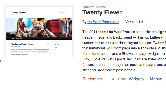
Most WordPress themes developed today are built to be responsive. That means the theme responds to the needs of the viewers and their devices, shifting the layout based on the screen size, resolution, and device capabilities.
Here’s the Twenty Fifteen theme, which is fully responsive, on a desktop computer, tablet, and phone:
Twenty Fifteen’s responsive design
The layout adjusts based upon the screen size. The site keeps a consistent look, but adapts to the smaller screens. No matter what screen size a site visitor is using, it will automatically adjust — and since screen sizes are continually changing, the site can adapt to any screen size today and in the future.
How can you check to see if your theme is responsive? If you’re on a desktop machine, go to the site you want to test, let it load, then make your browser screen narrower. If the site has a responsive design, the elements from the web page will start to adjust and rearrange themselves into a still-readable format.
You can also check this using your own mobile device: simply visit the site you want to test and see how it looks. If it looks like exactly the same as the desktop version but shrunk down, your site is likely not responsive.
How can Jetpack help?
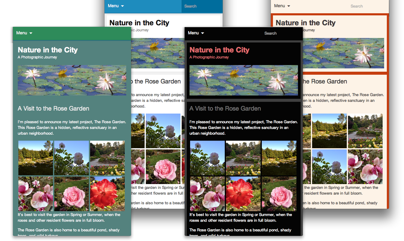
Jetpack’s Mobile Theme in action.
If your site isn’t responsive and you’re not able to update your theme to one that is, you can use the Jetpack Mobile Theme to create a simplified, mobile-friendly version of your website. The Mobile Theme displays your content in a clean, uncluttered interface for phones, making it easy for visitors to access your newest content on the go.
The default mobile theme has a pleasing blue color, but you can also tailor the Mobile Theme to bring your site’s mobile experience more in line with the full-screen version. You can customize the kinds of content that appear on your mobile home page, the colors, and the header.
In addition, viewers have the option to switch to the desktop version of your site by tapping the “View Full Site” link at the bottom of each page, so they can still choose to have the full site experience.
Ready to make your site mobile-friendly? Activate the Jetpack Mobile Theme in your Jetpack settings, and check out our support documents for more detail on how to customize it!
Please note: Mobile Theme was deprecated in March, 2020. The following information is being kept for posterity.
Howdy Jetpackers,
You might already be familiar with the Mobile Theme module: it displays your content in a clean, uncluttered interface for phones, making it easy visitors to access your latest post on the go.
If you have enabled the Mobile Theme module, your mobile visitors see a fresh blue home page:
But did you know you could customize the look of this Mobile Theme? With a few simple changes, bring your site’s mobile experience more in line with the full-screen version. Your can customize both the kinds of content that appear on your mobile home page and the colors and header.
Customize the contents of your homepage
The Mobile Theme includes two home page options:
You can choose to display excerpts or full posts on the home and archive pages.
You can show a promo for WordPress mobile apps in your footer.
Access these options by clicking on Configure under the Mobile Theme module in the Jetpack menu.
Change the look of the theme
It does use a lovely shade of blue, but what if the Mobile Theme could use the same color scheme as your desktop theme? The same header and background? Luckily, you can do just that — and more!
We’ll go through three ways to customize the Mobile Theme. Depending on what you want to do and how comfortable you are with code, you can make changes through the Customizer, with CSS, or with actions and filters.
Through the Customizer
If your theme features a Custom Background or a Custom Header, the images or colors will automatically be ported over to the Mobile Theme, no additional work needed.
To get started with headers and backgrounds, go to Appearance >> Themes in your dashboard, and click “Customize”:
If your desktop theme supports them, you’ll be able to specify a custom header or a custom background for your desktop and Jetpack’s Mobile theme.
Through the Custom CSS Module
Jetpack includes a module named Custom CSS that allows you to add your own CSS code without having to edit your theme stylesheet. The custom CSS editor is available under Appearance >> Edit CSS in your dashboard.
You may have used it to make changes to your desktop theme, but it also includes a Mobile-compatible option:
If you choose the mobile compatible option, all your custom CSS will also apply to the Mobile theme.
You can also use CSS to make changes that are specific to the Mobile theme. To do that, use the .mobile-theme class to target only the Mobile theme.
Through actions and filters
Jetpack’s Mobile theme, like other themes and plugins, uses actions and filters to add data and features to your site. If you want to remove or edit some of the mobile theme’s functions, you can build a small plugin.
Here is a small example: we will add post authors’ Gravatar images before each post on the mobile home page. To do this, we’ll create a new function named jetpackme_author_image, and we will hook that function into the the_content filter.
// Check if we are on mobile
function jetpackme_is_mobile() {

    // Are Jetpack Mobile functions available?
    if ( ! function_exists( 'jetpack_is_mobile' ) )
        return false;

    // Is Mobile theme showing?
    if ( isset( $_COOKIE['akm_mobile'] ) && $_COOKIE['akm_mobile'] == 'false' )
        return false;

    return jetpack_is_mobile();
}

// Let's add the post author's Gravatar image, but only if we're on a mobile device
function jetpackme_maybe_add_filter() {

    // On mobile, and on the home page?
    if ( jetpackme_is_mobile() && is_home() ) {
        add_filter( 'the_content', 'jetpackme_author_image' );
    }
}
add_action( 'wp_head', 'jetpackme_maybe_add_filter' );

// Build the function
function jetpackme_author_image( $content ) {

    global $post;
    $avatar = get_avatar( $post->post_author );

    return $avatar . $content;
}
You could use a similar method to add, edit, or remove features from the Mobile theme. (If you do, please let us know about the cool things you built with the Jetpack Mobile Theme!)
Is there anything else you’d like to know about Jetpack’s Mobile Theme? Is there a particular Jetpack module you’d like to learn more about? Let us know!


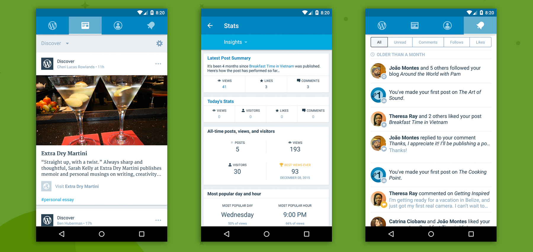


Tips for Managing Your Site from Your Mobile Device
Since the advent of the smartphone, it’s rare to find a website that isn’t optimized for use on mobile devices. Managing your website via your phone or tablet, however, is still a fairly new concept.
Managing your site from a mobile device makes running a business more convenient. It’s beneficial for photographers who want to upload photos from their smartphones, bloggers who are inspired by their surroundings on-the-go, ecommerce sellers who want to keep tabs on their site stats, and any other type of website owner.
Let’s take a look at a few ways you can manage your WordPress site from your mobile device, and some tips for getting the most out of your mobile experience with Jetpack.
Continue reading → Tips for Managing Your Site from Your Mobile Device