
Businesses, websites, and organizations gather a lot of data every day. But raw data isn’t helpful on its own. To make use of that information, you need tools that can help you track, organize, and visualize it.
That’s where analytics dashboards come in. They give you a simple way to turn complex data into something easy to understand. Instead of combing through numbers, you get clear insights that can help you make better decisions.
What is an analytics dashboard?
An analytics dashboard is a tool that helps you visualize data in a way that is easy to understand. It pulls in data from different sources and presents it in one place, often using charts, graphs, and tables. Instead of looking through raw numbers or detailed reports, you get a visual summary of the data that matters most to you. This makes it easier to spot trends, track progress, and make informed decisions.
Dashboards are used across many industries to monitor performance and key metrics. Whether you are tracking web analytics like traffic, sales, or user engagement, the dashboard organizes data in a way that highlights what’s important. It’s a practical solution to keep data accessible and actionable.
Key components of an analytics dashboard
A well-designed analytics dashboard should be simple to use and clearly display the right information. The key components of any good dashboard include the metrics you want to track, visualizations to help interpret the data, and interactive elements that allow you to dig deeper into the numbers. Here’s a breakdown of each:
1. Metrics and KPIs
Metrics and key performance indicators (KPIs) are the core of any dashboard. These are the numbers that reflect how well you’re meeting your goals. Depending on what you’re tracking, metrics could include anything from daily sales to website traffic. KPIs are specific targets within those metrics, such as a goal of 1,000 new visitors a day. You need to choose the right KPIs to measure your performance based on what matters most to meet your overarching objectives. Then, of course, ensure your platform of choice can measure that information.
2. Visualizations
Charts, graphs, and other visualizations make data easier to understand at a glance. You can quickly see trends and patterns in your data without having to analyze a spreadsheet. The type of visualization you use depends on the kind of data you’re working with. For example, bar charts might be better for comparing different categories, while line graphs are ideal for showing trends over time.
3. Interactive elements
Interactive dashboards let you filter or drill down into the data for deeper insights. Instead of just viewing a static report, interactive elements allow you to explore the data in more detail. For example, you might click on a specific metric to see the numbers behind it or apply a filter to look at a particular time period. This flexibility helps you get the most value from your data.
Why are analytics dashboards important?
Analytics dashboards play a crucial role in helping businesses and website owners make sense of their data. They take raw numbers and transform them into insights that can guide decisions, track progress, and highlight areas for improvement. Here’s why they matter:
They help in making informed decisions swiftly
More than ever, decisions need to be made quickly. But making choices without the right information leads to more mistakes. Dashboards let you view up-to-date data in real time, allowing you to respond to changes immediately. Whether it’s adjusting a marketing campaign or reacting to a sudden drop in sales, having the right data on hand ensures your decisions are based on facts.
They simplify complex data into understandable visuals
Data can be overwhelming, especially when it’s presented in long reports or spreadsheets. Analytics dashboards break this data down into simple visualizations. Charts and graphs make it easier to spot trends, track progress, and compare performance over time. This makes it simpler to communicate the insights you gather, whether you’re sharing them with your team or making decisions on your own.
They keep track of conversions and goal completions
For businesses, it’s important to know how well your strategies are performing. Dashboards make it easier to track conversions and goal completions, whether that means product purchases, leads generated, or content engagement. Monitoring these metrics in one place gives you a clear picture of whether your strategies are working or if adjustments need to be made.
Types of analytics dashboards
Different types of analytics dashboards serve different purposes. While they all present data in a visual format, each type is designed to answer specific kinds of questions or solve particular problems. Understanding the main types of dashboards can help you choose the right one for your needs.
1. Operational dashboards
Operational dashboards provide real-time data and are often used to monitor day-to-day activities. They focus on short-term metrics, such as the number of transactions happening in a given moment or current website traffic. These dashboards are great for teams that need to respond quickly to changes or monitor performance in real time.
2. Strategic dashboards
Strategic dashboards are built to provide a high-level overview of long-term goals and key performance indicators. They tend to focus on big-picture data that helps management track progress toward overarching business objectives. While these dashboards are updated regularly, they’re not designed for minute-to-minute monitoring like operational dashboards.
3. Tactical dashboards
Tactical dashboards are geared toward midterm goals and typically used by managers who need to monitor specific processes or campaigns. They focus on actionable data, such as the performance of a marketing campaign or the effectiveness of a customer service initiative. These dashboards help track progress, identify issues, and guide adjustments to improve results.
4. Analytical dashboards
Analytical dashboards are used to explore data in more depth. They allow you to investigate patterns, correlations, and deeper insights beyond just the surface-level metrics. These dashboards are often interactive, letting users dig into the data and explore trends over time. Analytical dashboards are commonly used for long-term strategic analysis and complex problem-solving.
The three pillars of an effective analytics dashboard
For an analytics dashboard to be truly useful, it needs to do more than just display data. A good dashboard should provide the right information in a way that’s easy to access and understand. There are three key factors that contribute to an effective analytics dashboard: real-time data monitoring, a user-friendly interface, and customizable views.
Real-time data monitoring
One of the biggest advantages of an analytics dashboard is that it can pull in live data. This allows you to monitor performance as it happens, rather than waiting for a report to be generated. Real-time monitoring is especially helpful for businesses that need to respond quickly to changes, such as ecommerce sites or customer service teams. The ability to track shifts in key metrics in real time gives you more control over your operations.
User-friendly interface
A dashboard is only useful if people can actually understand it. That’s why the design and layout of your dashboard should prioritize simplicity and ease of use. A user-friendly interface ensures that anyone, regardless of their technical background, can navigate the dashboard and find the information they need without hassle. Well-designed dashboards use clear labels, intuitive navigation, and simple visualizations that don’t overwhelm users with too much detail.
Customizable views / filters
Not all users will want to see the same data in the same way. A flexible dashboard lets you customize what information is displayed, how it’s organized, and which filters are applied. This means different users can tailor the dashboard to their specific needs — whether it’s a marketing manager focusing on campaign performance or a sales team tracking conversion rates. The ability to adjust views and apply filters ensures the dashboard remains relevant for each user’s specific goals.
Real-world use cases of analytics dashboards
Analytics dashboards are not limited to one industry or type of business. They provide value in many different contexts by helping organizations track performance and make informed decisions. Below are some practical examples of how different types of businesses use analytics dashboards to their advantage.
Ecommerce sites: Track sales and product performance
For ecommerce businesses, tracking sales and product performance is crucial. An analytics dashboard can show data on which products are selling the most, how much revenue is being generated, and what the conversion rates are. This helps ecommerce managers spot trends, adjust pricing strategies, and optimize inventory management based on what’s actually selling.
Simple, yet powerful stats to grow your site
With Jetpack Stats, you don’t need to be a data scientist to see how your site is performing.
Get Jetpack StatsBlogs: Track engagement and post performance
For bloggers, understanding how well content is performing can help improve future posts. Dashboards can track page views, time on page, and engagement metrics such as comments or shares. By monitoring these figures, bloggers can see what type of content resonates with their audience, allowing them to refine their strategy for better engagement or even refine existing posts to improve rankings to better engage readers.
SaaS firms: Track product usage and churn rates
Software-as-a-Service (SaaS) companies rely heavily on usage data to understand customer behavior. Analytics dashboards help track how often users log in, which features they use most, and may even provide a score that indicates whether they’re likely to churn. Tracking churn rates and usage patterns helps SaaS companies focus their efforts on customer retention, product improvements, and personalized user experiences.
Service providers: Track referral sources and lead generation
For service-based businesses, generating leads and tracking referral sources are key to growth. Dashboards allow service providers to see where their leads are coming from — whether it’s social media, direct traffic, or referrals. With this data, they can focus their marketing efforts on the most effective channels and track how well their campaigns are performing in terms of lead generation.
Membership sites: Understand member engagement and churn rate
Membership sites need to keep members engaged and reduce churn to maintain a healthy subscription base. Dashboards can track engagement metrics, such as login frequency, time spent on the site, and usage of member-only features. These insights help site owners identify which members are at risk of leaving and create strategies to re-engage them, such as sending targeted emails or offering exclusive content.
Examples of analytics dashboards
Analytics dashboards come in many forms, and various platforms offer different features depending on your needs. Whether you’re managing a website, tracking business performance, or monitoring technical infrastructure, there is a dashboard solution tailored to your requirements.
Here are some examples of popular analytics dashboards that provide value in specific contexts:
Jetpack Stats for WordPress site analytics
For WordPress site owners, Jetpack Stats is an ideal solution for tracking site performance. Jetpack Stats offers a simple yet effective way to monitor traffic, visitor behavior, and engagement metrics — all from within the WordPress dashboard. You can track daily visits, popular posts, referral sources, and even geographic data about your audience.
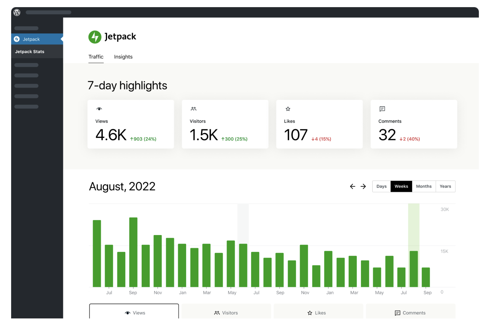
What makes Jetpack Stats convenient is its ease of use. It requires minimal setup and no technical expertise to get started. It provides an all-in-one view of your site’s activity, making it easy to make data-driven decisions on content and marketing efforts.
Learn more about Jetpack Stats here.
Tableau for business intelligence
Tableau is a widely-used platform for business intelligence and data visualization. It enables businesses to analyze large datasets and create detailed visual reports. With Tableau, users can build custom dashboards that track key business metrics such as sales performance, customer behavior, and market trends.
It offers robust tools for filtering and organizing data, helping businesses make informed decisions based on comprehensive insights. Though it’s powerful, Tableau typically requires a bit of learning to use it effectively, especially for creating more advanced visualizations.
Datadog for IT cloud monitoring
Datadog is a specialized analytics dashboard for monitoring cloud infrastructure, applications, and services. It’s widely used in IT operations to track performance metrics such as server uptime, database queries, and error rates.
With Datadog, teams can set up real-time alerts when systems are down or when specific thresholds are reached. This allows IT professionals to address issues quickly and prevent disruptions. Datadog’s interactive dashboards give you a clear view of your infrastructure’s health, making it easier to identify bottlenecks and optimize system performance.
Actionable steps to make the most of your analytics dashboard
Having an analytics dashboard is only useful if you know how to make the most of it. You can have access to all the data in the world, but if it isn’t used to inform decisions and improve strategies, it’s not doing you much good. Here are some practical steps to help you get the most out of your dashboard.
1. Define specific goals that you want to achieve
Before diving into the data, it’s important to define what you want to achieve. Whether it’s increasing website traffic, boosting sales, or improving customer satisfaction, having clear, measurable goals will give you direction. When you know what you’re aiming for, it becomes easier to decide which metrics matter most.
2. Focus on metrics that align with your goals
Dashboards can display a lot of information, but not all of it is relevant to your goals. Focus on tracking the key performance indicators (KPIs) that align with what you want to achieve. For example, if your goal is to increase conversions, metrics like bounce rate and average time on site may not be as crucial as conversion rate or checkout abandonment.
3. Schedule regular intervals to analyze your data
Data analysis should not be a one-time activity. Set a regular schedule to review your dashboard. This might be daily, weekly, or monthly, depending on the speed at which your business moves. Regular check-ins will help you track progress and make timely adjustments.
4. Use the data to refine your strategy
The purpose of your dashboard is to help you make better decisions. Once you’ve reviewed the data, use it to guide changes in your business strategy. If your dashboard shows a drop in traffic or sales, look into potential causes and adjust your efforts accordingly. Being responsive to what your data tells you is key to staying on track toward your goals.
5. Iterate and improve based on ongoing data analysis
Your dashboard insights will evolve as your business grows, and so should your strategies. Continuously refine your metrics, KPIs, and tactics based on the data you collect over time. The more you iterate, the better you’ll be at identifying opportunities for growth and improvement.
Frequently asked questions about analytics dashboards
When it comes to analytics dashboards, people often have a few common questions. Below are some straightforward answers to help clarify how dashboards work and how they can benefit your business.
What’s the difference between a report and a dashboard?
A report is a detailed document that presents a snapshot of data at a specific point in time. It’s often static and might require manual updates. A dashboard, on the other hand, is dynamic and interactive. It pulls in real-time or regularly updated data and presents it in an easy-to-read format. Dashboards allow you to explore the data in more depth by applying filters, sorting data, or drilling down into specific areas.
What’s the difference between a KPI and a metric?
Metrics are the individual data points you track, such as website visits, revenue, or conversion rates. A KPI (Key Performance Indicator) is a specific metric that you use to measure progress toward a defined business goal.
In other words, all KPIs are metrics, but not all metrics are KPIs. For example, if your goal is to increase sales, your KPI might be the number of sales per week, while metrics like the number of website visits could provide context but may not be KPIs unless directly tied to your goal.
Can dashboards show real-time data, or are they updated periodically?
Dashboards can display both real-time data and data updated at regular intervals. The frequency of updates depends on the type of dashboard and the systems feeding data into it. For instance, an operational dashboard might show live data for sales or web traffic, while a strategic dashboard could be updated daily or weekly to track long-term performance trends.
Can small businesses benefit from using analytics dashboards?
Yes, small businesses can gain significant value from using analytics dashboards. They provide an easy way to monitor important data, track progress, and make informed decisions. Even without a dedicated analytics team, a well-set-up dashboard can help small business owners quickly understand what’s working and where improvements are needed.
Do I need technical or coding skills to set up an analytics dashboard?
No, many analytics dashboards are designed to be user-friendly and don’t require any technical skills to set up.
For example, Jetpack Stats is an analytics tool for WordPress that can be installed with just a few clicks. It automatically integrates with your site and provides essential insights like traffic sources, popular content, and audience demographics. No coding knowledge is necessary, making it an accessible option for anyone managing a WordPress site.
Simple, yet powerful stats to grow your site
With Jetpack Stats, you don’t need to be a data scientist to see how your site is performing.
Get Jetpack Stats