Sometimes you do not want to see a specific module in the Jetpack menu. You might not use it at all, or you might want to make sure other admins can’t activate it.
For such cases, you can use the jetpack_get_available_modules filter to control the list of modules available in Jetpack.
The Top Posts widget offers different options to display a list of posts, or a grid of post thumbnails. In some cases, you might want to change the size of the thumbnails used by this widget.
To do so, you’ll need to change the size parameters in the image source, by adding the following code to your theme’s functions.php file, or to a functionality plugin:
To change the thumbnail size, you will also need to add some custom CSS to overwrite Jetpack’s default CSS. You can paste this CSS in your theme’s stylesheet, or under Appearance > Edit CSS in your dashboard:
You can use the following code to automatically close comments in the Carousel view, based on the number of days you’ve defined in Settings > Discussion:
You can add the following code to a functionality plugin to remove the Jetpack Sharing buttons in the Mobile Theme:
// Check if we are on mobile
function jetpackme_is_mobile() {

    // Are Jetpack Mobile functions available?
    if ( ! function_exists( 'jetpack_is_mobile' ) )
        return false;

    // Is Mobile theme showing?
    if ( isset( $_COOKIE['akm_mobile'] ) && $_COOKIE['akm_mobile'] == 'false' )
        return false;

    return jetpack_is_mobile();
}

// Let's remove the sharing buttons, but only if we're on a mobile device
function jetpackme_maybe_add_filter() {

    // On mobile, and on the home page?
    if ( jetpackme_is_mobile() ) {
        remove_filter( 'the_content', 'sharing_display', 19 );
		remove_filter( 'the_excerpt', 'sharing_display', 19 );
    }
}
add_action( 'wp_head', 'jetpackme_maybe_add_filter' );

// Build the function
function jptweak_remove_share() {
	remove_filter( 'the_content', 'sharing_display', 19 );
	remove_filter( 'the_excerpt', 'sharing_display', 19 );
}
Looking for more mobile tips? You’ll find them here!
Posted inDevelopers|Comments Off on Remove Jetpack Sharing buttons in the Mobile Theme
Jetpack includes many shortcodes allowing you to embed videos, audio files, images, and other media into your posts.
If you want to deactivate a specific shortcode without deactivating the Shortcodes module, you can add the following code to a functionality plugin. Please note that this will not work in a theme’s functions.php file due to the order in which WordPress loads plugins and themes and how we’re loading the shortcodes list.
In the code above, you’ll need to add to or remove shortcodes from the $shortcodes_to_unload array. It requires the file name of the shortcode you want to deactivate.
Posted inDevelopers|Comments Off on How to disable specific shortcodes in Jetpack
The Photon module resizes your site’s images on the fly, without cropping them. However, in some cases you might want Photon to apply a custom cropping when resizing certain images.
In the following example, we will use photon to serve Post thumbnails with custom cropping, and use a different cropping on single pages:
if( function_exists( 'jetpack_photon_url' ) ) {
    add_filter( 'jetpack_photon_url', 'jetpack_photon_url', 10, 3 );
}
function jeherve_display_custom( $content, $post ) {

	global $post;

	// If you didn't define a post thumnail, let's forget about all this
	if ( !has_post_thumbnail( $post->ID ) )
		return $content;

	// What's the cropping and the size of image we should use on Single pages?
	// See http://developer.wordpress.com/docs/photon/api/#crop for parameters
	if ( is_single() ) {
		$args = array(
		    'crop'   => '50,50,200px,200px',
		);
	}
	// resizing on other pages
	else {
		$args = array(
		    'resize'   => '200,400',
		);
	}

	// Let's create a Photon Image URL from the Post Thumbnail
	$feat_image_url = wp_get_attachment_image_src( get_post_thumbnail_id($post->ID), 'full');
	$photon_image_url = jetpack_photon_url( $feat_image_url[0], $args );

	// Let's build the image tag
	$our_image = sprintf( '<div class="post-media"><a class="featured-image" href="%1$s" title="%2$s"><img src="%3$s" class="wp-post-image" alt="Featured Image"></a></div>',
		esc_url( get_permalink() ),
		esc_attr( sprintf( __( 'Open %s', 'dot' ), get_the_title() ) ),
		esc_attr( $photon_image_url )
	);

	// Let's return the image, right before the post content
	return $our_image . $content;

}
add_filter( 'the_content', 'jeherve_display_custom' );
When you share a post on Facebook, or when Jetpack Social auto-shares a post to your Facebook page, Facebook crawls the page and looks for Open Graph meta tags to build a complete post preview (with an image, title, description, …).
Jetpack automatically creates these meta tags for you, so you don’t have to worry about it!
Jetpack will also add an Image meta tag to your home page if you use a Site Logo, or a Site Icon. If you don’t use any of these 2 options, you might want to add your own custom image meta tag there. To do so, add one of the following code snippets to your theme’s functions.php file, or to a functionality plugin:
function fb_home_image( $tags ) {
	if ( is_home() || is_front_page() ) {
		// Remove the default blank image added by Jetpack
		unset( $tags['og:image'] );

		$fb_home_img = 'YOUR_IMAGE_URL';
		$tags['og:image'] = esc_url( $fb_home_img );
	}
	return $tags;
}
add_filter( 'jetpack_open_graph_tags', 'fb_home_image' );
Alternatively, you can change the default image used any time Jetpack can not determine an image to use:
function custom_jetpack_default_image() {
	return 'YOUR_IMAGE_URL';
}
add_filter( 'jetpack_open_graph_image_default', 'custom_jetpack_default_image' );
It’s worth noting that the fallback image has to be larger than 200 x 200px, as per Facebook requirements. If your image is smaller, Facebook will ignore it.
Note: This snippet is no longer needed as Jetpack includes Search Pages by default now.
By default, Infinite Scroll is only active on your site’s home page as well as on the archive pages. You can, however, use the infinite_scroll_archive_supported filter to add support to other pages:
Please note: Mobile Theme was deprecated in March, 2020. The following information is being kept for posterity.
Howdy Jetpackers,
You might already be familiar with the Mobile Theme module: it displays your content in a clean, uncluttered interface for phones, making it easy visitors to access your latest post on the go.
If you have enabled the Mobile Theme module, your mobile visitors see a fresh blue home page:
But did you know you could customize the look of this Mobile Theme? With a few simple changes, bring your site’s mobile experience more in line with the full-screen version. Your can customize both the kinds of content that appear on your mobile home page and the colors and header.
Customize the contents of your homepage
The Mobile Theme includes two home page options:
You can choose to display excerpts or full posts on the home and archive pages.
You can show a promo for WordPress mobile apps in your footer.
Access these options by clicking on Configure under the Mobile Theme module in the Jetpack menu.
Change the look of the theme
It does use a lovely shade of blue, but what if the Mobile Theme could use the same color scheme as your desktop theme? The same header and background? Luckily, you can do just that — and more!
We’ll go through three ways to customize the Mobile Theme. Depending on what you want to do and how comfortable you are with code, you can make changes through the Customizer, with CSS, or with actions and filters.
Through the Customizer
If your theme features a Custom Background or a Custom Header, the images or colors will automatically be ported over to the Mobile Theme, no additional work needed.
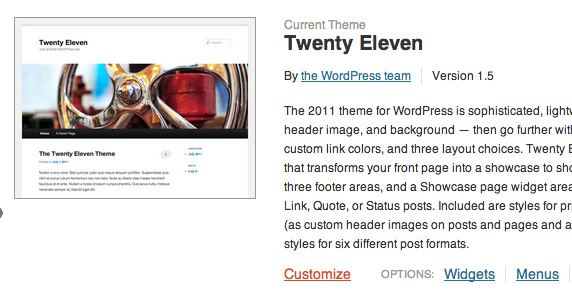
To get started with headers and backgrounds, go to Appearance >> Themes in your dashboard, and click “Customize”:
If your desktop theme supports them, you’ll be able to specify a custom header or a custom background for your desktop and Jetpack’s Mobile theme.
Through the Custom CSS Module
Jetpack includes a module named Custom CSS that allows you to add your own CSS code without having to edit your theme stylesheet. The custom CSS editor is available under Appearance >> Edit CSS in your dashboard.
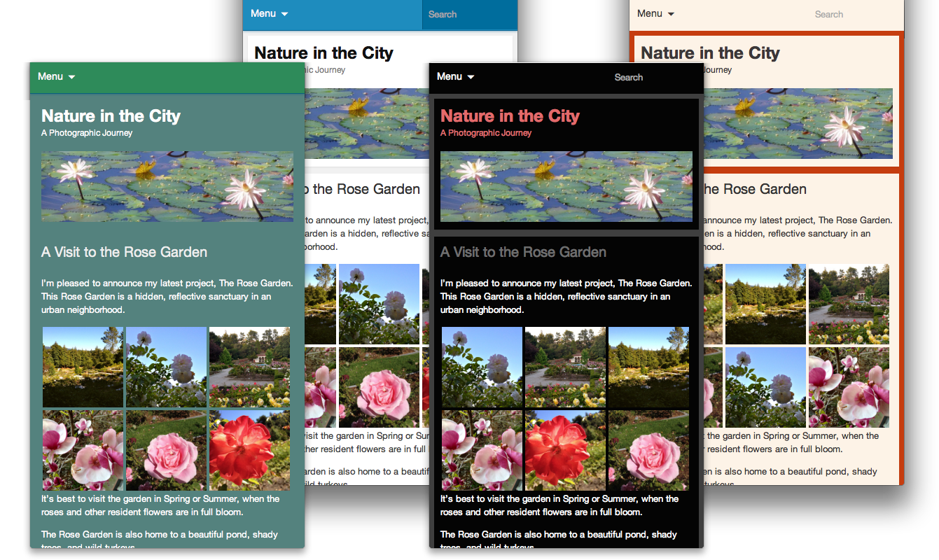
You may have used it to make changes to your desktop theme, but it also includes a Mobile-compatible option:
If you choose the mobile compatible option, all your custom CSS will also apply to the Mobile theme.
You can also use CSS to make changes that are specific to the Mobile theme. To do that, use the .mobile-theme class to target only the Mobile theme.
Through actions and filters
Jetpack’s Mobile theme, like other themes and plugins, uses actions and filters to add data and features to your site. If you want to remove or edit some of the mobile theme’s functions, you can build a small plugin.
Here is a small example: we will add post authors’ Gravatar images before each post on the mobile home page. To do this, we’ll create a new function named jetpackme_author_image, and we will hook that function into the the_content filter.
// Check if we are on mobile
function jetpackme_is_mobile() {

    // Are Jetpack Mobile functions available?
    if ( ! function_exists( 'jetpack_is_mobile' ) )
        return false;

    // Is Mobile theme showing?
    if ( isset( $_COOKIE['akm_mobile'] ) && $_COOKIE['akm_mobile'] == 'false' )
        return false;

    return jetpack_is_mobile();
}

// Let's add the post author's Gravatar image, but only if we're on a mobile device
function jetpackme_maybe_add_filter() {

    // On mobile, and on the home page?
    if ( jetpackme_is_mobile() && is_home() ) {
        add_filter( 'the_content', 'jetpackme_author_image' );
    }
}
add_action( 'wp_head', 'jetpackme_maybe_add_filter' );

// Build the function
function jetpackme_author_image( $content ) {

    global $post;
    $avatar = get_avatar( $post->post_author );

    return $avatar . $content;
}
You could use a similar method to add, edit, or remove features from the Mobile theme. (If you do, please let us know about the cool things you built with the Jetpack Mobile Theme!)
Is there anything else you’d like to know about Jetpack’s Mobile Theme? Is there a particular Jetpack module you’d like to learn more about? Let us know!