WordPress automatically creates multiple image sizes when you upload a file, including a featured image. This plays a key role in how your content is displayed in archives, blog listings, and search previews. However, the size can vary dramatically depending on your theme and settings, which can lead to inconsistent layouts or performance issues.
This guide covers how to change the featured image size in WordPress manually and automatically. You’ll also learn best practices for featured image dimensions, common mistakes to avoid, and how image size affects performance and design.
What is a featured image in WordPress?
A featured image is a theme-supported thumbnail or header image associated with a post, page, or custom post type. It’s commonly displayed:
- On blog archive pages
- In widgets or post sliders
- As an Open Graph image for social sharing
- Inside single post templates
Themes use featured images differently. Some display large banner-style visuals, while others rely on smaller thumbnails. Since the image is automatically resized based on theme settings or hardcoded dimensions, mismatched proportions and cropped visuals are common.
Default WordPress image sizes
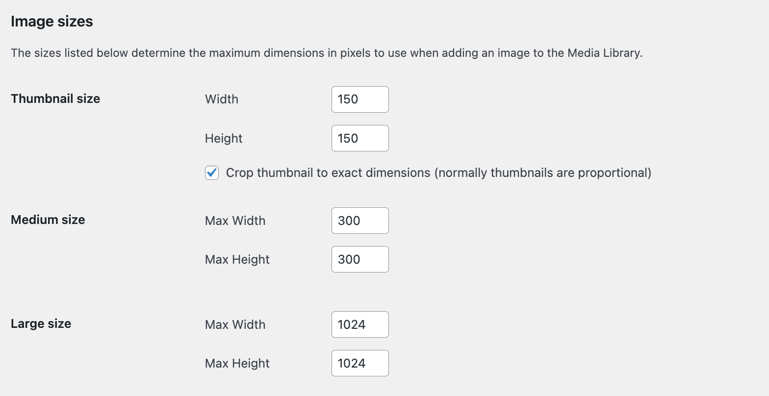
When you upload an image, WordPress creates several versions by default:
- Thumbnail: 150×150 pixels (cropped)
- Medium: 300×300 pixels (scaled)
- Large: 1024×1024 pixels (scaled)
- Full Size: Original image resolution
You can edit these settings under Settings → Media, but changing them doesn’t retroactively affect previously uploaded images or sizes defined by your theme.
Why should you change the featured image size?
Here are common reasons to modify featured image dimensions:
- Your theme displays images inconsistently.
- Cropping cuts off key visual elements.
- Load times suffer due to oversized images.
- Layouts look broken on mobile or desktop.
- You need better control over aspect ratio or visual hierarchy.
Fixing the featured image size can improve both design consistency and performance metrics like Core Web Vitals.
How to change featured image size in your theme
1. Modify the theme’s image sizes
If you’re building or customizing a theme, use the add_image_size() function to define new image sizes. If you’re not used to working with code, it’s best to use one of the other methods here. Always use a child theme and have a backup on hand before making changes.
Add this function to your theme’s functions.php file:
add_image_size( ‘custom-featured’, 800, 450, true );
- The first parameter is the name of the image size.
- The second and third are width and height in pixels.
- The fourth (true/false) enables hard cropping.
Once defined, call this image size in your theme template:
the_post_thumbnail( 'custom-featured' );
Use descriptive names like home-featured, single-featured, or card-thumb if you’re defining multiple variants.
2. Regenerate thumbnails
Changing image size definitions does not affect images that are already on your site. First, edit the image sizes as mentioned above in Settings → Media. Then, use a plugin like Regenerate Thumbnails to apply your new sizes across all existing and future images:
- Install and activate the Regenerate Thumbnails plugin.
- Go to Tools → Regenerate Thumbnails
- Choose between regenerating thumbnails for all attachments or just featured images.

This will generate new versions of your existing images based on the latest size settings.
How to change featured image size with a plugin
For non-developers or site owners without code access, there are plugins that can simplify the process. We already discussed using the Regenerate Thumbnails plugin to automatically resize existing and new images based on updated size settings.
Or, the Image Regenerate & Select Crop plugin allows you to override built-in crop options, register new sizes, and regenerate images across your site.
Each tool has its own documentation where you can find full installation and setup instructions.
Recommended featured image sizes by use case
There is no one-size-fits-all solution. Featured image dimensions should match your layout, screen strategy, and aesthetic. That said, these common dimensions work well across most use cases:
| Use case | Recommended size | Notes |
| Blog archive thumbnails | 400 x 250 pixels | Lightweight, rectangular thumbnails |
| Single post hero banner | 1200 x 675 pixels | 16:9 aspect ratio for wide displays |
| Social sharing (Open Graph) | 1200 x 630 pixels | Matches Facebook and Twitter requirements |
| Grid layout cards | 600 x 400 pixels | Balanced size for image-heavy cards |
| Fullscreen featured image | 1920 x 1080 pixels | For high-res banners or portfolio sites |
Best practice: Use a consistent aspect ratio (16:9, 3:2, 4:3) across your site to avoid layout shifts and awkward cropping.
How to check which featured image size your theme uses
Before making changes, audit how your theme handles featured images:
- Inspect theme files: Look in index.php, single.php, content.php, or template parts for the_post_thumbnail().
- Use developer tools: Right-click an image on your site and choose Inspect Element. Check:
- The actual image size loaded (e.g., -300×200.jpg)
- The image srcset and sizes attributes
- Use the Query Monitor Plugin: This advanced tool shows image sizes and template file references, useful for debugging.
SEO and performance considerations
Changing featured image size has broader effects than just site layout, including:
- Page load times: Oversized images slow down your site. Use appropriate sizes for different contexts and devices, and activate an image CDN to serve optimized versions based on visitor location and screen resolution. Jetpack Boost includes a free image CDN that automatically handles this optimization for you.
- Mobile responsiveness: Use srcset and sizes attributes to deliver scaled versions based on screen width.
- Lazy loading: WordPress lazy loads images by default, but ensure that your theme offers support for this feature.
- Image compression: Compress all featured images using a tool like Jetpack Boost.
- Alt text: Always set relevant alt text for featured images to support accessibility and search engine optimization (SEO).
Final checks
Before wrapping up your image size updates, ask yourself:
- Are all featured images regenerated using the new dimensions?
- Do images appear consistent across all templates and devices?
- Are Open Graph and social images displaying correctly when shared?
- Have you tested load speed via tools like PageSpeed Insights or GTmetrix?
The easiest speed optimization plugin for WordPress
Jetpack Boost gives your site the same performance advantages as the world’s leading websites, no developer required.
Boost your site for freeWhen image size isn’t the problem
If your featured images still have problems after adjusting sizes, the issue may lie elsewhere. It’s possible that:
- Your theme CSS may constrain image height or width.
- The image file itself may be too small or oddly cropped.
- Your CDN might be serving cached versions.
- A plugin or page builder may override default settings.
Always inspect and test before assuming the image size is the root cause.
Frequently asked questions
What is the ideal size for a featured image in WordPress?
The best size for a featured image in WordPress is 1200×675 pixels, which uses a 16:9 aspect ratio. This size works well across blog listings, single posts, and social media platforms like Facebook and Twitter.
However, your theme’s layout ultimately dictates the most effective size. If your layout uses square thumbnails or full-width banners, adjust accordingly. Consistent aspect ratios prevent layout shifts and improve visual alignment sitewide.
How do I create a custom featured image size in WordPress?
To define a custom featured image size in WordPress, add the add_image_size() function to your theme’s functions.php file. For example:
add_image_size( 'custom-featured', 800, 450, true );
This creates a hard-cropped image at 800×450 pixels. To use it in your theme, call:
the_post_thumbnail( 'custom-featured' );
After creating the new size, regenerate your thumbnails using a plugin like Regenerate Thumbnails. This ensures all previously uploaded images are resized to the new dimensions.
How do I find the featured image size my WordPress theme is actually using?
The fastest way is to check what image file WordPress is loading on a real post. Open a post on the front end. Right click the featured image, then choose Inspect in your browser. Look for the image URL in the HTML. Many WordPress image files include the size in the file name, such as photo-1200×675.jpg.
Also check srcset, which lists several sizes WordPress can choose from. If the theme uses a custom size name, you may not see the name in the HTML, but you will still see the pixel sizes in the file names inside srcset. This tells you what size the theme actually uses, not what you set in Media Settings.
How do I prevent WordPress from cropping my featured images?
To prevent WordPress from cropping your featured images, set the cropping parameter in the add_image_size() function to false:
add_image_size( 'custom-size', 800, 450, false );
This tells WordPress to scale the image proportionally instead of hard-cropping. The full image remains intact, but may not match the exact dimensions specified. Use CSS to maintain layout consistency if image sizes vary slightly due to proportional scaling.
Do I need to regenerate thumbnails after changing image sizes in WordPress?
Yes, regenerating thumbnails is necessary any time you add or modify image sizes. WordPress only generates image sizes at the time of upload.
To apply new dimensions to previously uploaded images, use a plugin like Regenerate Thumbnails. This processes your Media Library and creates new image files based on the updated settings, ensuring consistency across your site.
Why are my featured images blurry or pixelated in WordPress?
Blurry featured images usually result from displaying a low-resolution image at a larger size. Common causes include:
- Using a thumbnail size that’s too small for its display container.
- WordPress scaling up an image instead of using an appropriate version.
- Uploading images with low original resolution.
To fix this, upload high-resolution images (at least as large as the largest display area), define appropriate custom image sizes, and ensure that your theme templates use the correct size.
How do I make featured images responsive in WordPress?
WordPress supports responsive images using srcset and sizes attributes by default. To ensure featured images are responsive:
- Use the the_post_thumbnail() function, which includes responsive markup.
- Upload high-resolution images so WordPress can generate multiple sizes.
- Avoid hardcoded width/height styles in your CSS or HTML.
- Let the browser select the optimal image based on screen size and resolution.
Themes and page builders that strip srcset or apply fixed sizing can break this behavior, so test across devices and screen widths.
Can I set different featured image sizes for different post types or templates?
Yes, you can define unique featured image sizes for specific post types or templates. In your functions.php file, register multiple custom image sizes:
add_image_size( 'news-featured', 600, 400, true );add_image_size( 'portfolio-featured', 1200, 800, true );
In your theme template files, call the relevant size:
the_post_thumbnail( 'news-featured' );
To automate this further, use conditional logic in your templates to dynamically load sizes based on post type. This helps maintain visual consistency across varied content formats.
What’s the difference between featured image size and image file size?
Featured image size refers to the displayed dimensions (e.g., 1200×675 pixels). Image file size refers to the storage weight (e.g., 150 KB). Both affect performance, but in different ways:
- Large dimensions can stretch layout or load the wrong variant.
- Large file sizes slow down page speed and increase bandwidth usage.
Optimize both by:
- Choosing the correct dimensions based on layout.
- Compressing images upon upload using tools like Jetpack Boost.
- Serving responsive sizes via srcset to minimize file weight on mobile.
Keeping both in check is essential for fast, visually consistent WordPress sites.
The easiest speed optimization plugin for WordPress
Jetpack Boost gives your site the same performance advantages as the world’s leading websites, no developer required.
Boost your site for free Jetpack