
If visitors can’t figure out how to get in touch, many will leave without taking the next step. That’s why your contact form matters. A well-designed form helps visitors reach you faster and makes it more likely they’ll actually reach out at all.
Creating an effective form, however, takes more than just adding a few fields and a “submit” button. The best forms are quick to complete and avoid unnecessary friction.
This guide covers proven ways to improve your contact form’s performance. Each best practice offers a straightforward approach that doesn’t require development skills. Let’s dive in!
1. Keep it short and sweet
The more fields you include, the fewer people will complete the form. Most visitors don’t have the time to complete a long list of questions.
Start with only the essentials. For many sites, that means collecting a name, email address, and short message. That’s enough to start a conversation.
If you need more details, make those fields optional. You can always request more information after the initial contact.
2. Use a single-column layout
A single-column form feels more natural to move through since most people (in the west, at least) read from left to right, top to bottom. A vertical layout keeps their attention moving in one direction.
Placing fields side by side interrupts the flow. Visitors will pause to think about where to look first, which slows them down.
A single-column layout also works better on mobile devices. They eliminate horizontal scrolling and make the form simpler to tap through.
3. Clearly mark required fields
Let people know exactly what they need to fill out. When forms don’t indicate which fields are required, it creates confusion that often leads to abandonment.
To prevent this, always mark required fields with an asterisk or a “required” label. Pick one method and apply it uniformly across the form.
Also, avoid surprises. Don’t wait until someone clicks Submit to flag missing information. Highlight required fields from the start to prevent errors and help visitors complete the form without frustration.
4. Group related fields
When you group similar fields together, like name, address, or company details, it helps people move through the form more naturally.
Place related items next to or near each other. For example, if you ask for someone’s first name and last name, put those fields sequentially together. The same goes for address fields, phone numbers, or company info.
This structure keeps the layout clean and reduces mental effort. When a form feels organized, visitors are more likely to finish it without dropping off.
5. Make fields work well on mobile
Many people complete forms on their phones, so your layout needs to adapt to smaller screens. To account for this, use large tap targets to reduce accidental clicks. Pick the right input type, too. So, if you ask for a phone number, use the “tel” input so a number pad shows up. These small adjustments make data entry faster and more accurate.
Also, check your layout on different devices and screen sizes to confirm that nothing gets cut off or becomes difficult to use. A well-optimized mobile form scrolls smoothly, keeps inputs visible, and eliminates the need to zoom in or pan around.
6. Make the form accessible to everyone
Forms should be usable by all visitors, including those relying on screen readers, keyboard navigation, or other assistive technology.
To ensure this, label every field clearly. Don’t rely on placeholder text alone. Make sure people can tab through form fields in the right order using a keyboard. Also, add descriptive alt text for any icons or buttons that aren’t standard HTML elements.
Pay attention to color contrast as well. Text should stand out clearly against the background so it’s legible by all, including those with low vision or color blindness. Use high-contrast colors and legible fonts to better support readability.
Accessibility isn’t optional. It’s a basic part of making your site work for more people and deserves to be a priority.
7. Use multi-step forms when needed
Long forms sometimes discourage people from finishing them. If you need to collect a lot of information, split the questions across smaller steps.
Start with basic contact details, then move to more specific topics like service preferences or scheduling. Keep each step short and focused. Use a progress bar or simple labels like “Step 1 of 3” so people know how much is left.
Multi-step forms work well for more complex industries. People are more likely to finish when they only see a few fields at a time. Keep in mind, though, that single-page, basic forms remain the more conversion-ready option.
8. Include a strong CTA
Your form needs a clear next step. A strong call to action (CTA) sets expectations and encourages follow-through.
Use short, specific language that tells people what will happen when they click. Say things like “Get your free quote,” “Send your message,” or “Book a demo.” Avoid vague words like “Submit” or “Click here.”
The best CTAs help visitors feel certain. They know their message will go through and they know what happens next.
9. Position forms strategically
Put your form in a place where it’s visible without scrolling too far. Often, this resides near the top of a landing page or right after a key message. On longer pages, add the form again near the bottom or at natural stopping points.
Also think about context. If a visitor just read about a service or offer, that’s a good place to show a form. It helps them act while the information is still fresh.
10. Add microcopy to guide and reassure
People hesitate when they’re unsure what to type or worry about how their data will be used. Microcopy helps solve that.
Use brief text below or beside fields to explain their purpose. For example, under the email field, include a note like, “We’ll only use this to contact you.” Or near a phone number field, add text that reads, “Optional, but helps us follow up faster.”
Tooltips also improve clarity. A small question mark icon next to a label can explain what a field means without cluttering the layout.
These details help visitors feel more confident and reduce errors. They also show you’ve thought about their user experience.
11. A/B test form elements regularly
Improving a form starts with understanding how people interact with it. A/B testing lets you compare different versions to see what works best.
Try changing one thing at a time, like the call-to-action text, number of fields, field order, or button color. Then, track completion rates to see which version performs better.
A/B testing reveals what your site visitors best respond to. Over time, you’ll find that small changes make a big difference. Keep testing, even after you’ve found a version that works. What works today might not work next month.
12. Use conditional logic when needed
Not every form needs to show every field. When you ask follow-up questions based on someone’s earlier answer, you make the form cleaner and more focused.
This is called conditional logic. For example, if someone checks a box saying they need support, then show a dropdown asking about the issue. If they don’t, that extra field stays hidden.
This keeps your form short for most, while still giving others a chance to add more info when it’s helpful. It’s a smart way to collect better data without adding clutter.
13. Optimize your thank you page
After someone submits your form, use the confirmation page to add value and guide next steps.
A clear thank you page confirms that the form worked and explains what happens next, like when to expect a reply. You can even offer a discount or suggest they sign up for your newsletter.
Seize this moment to keep people engaged. Even after the form is completed, you can still continue the conversation in this way.
14. Display trust signals near the form
Visitors feel more confident when they see signs of credibility. Placing social proof or trust badges close to the form builds that confidence and encourages people to proceed.
Use brief testimonials, a secure site badge, usage numbers, or partner logos to highlight just how reliable you are. These signals show new visitors that others already trust your site and that submitting the form won’t pose a risk.
15. Provide clear privacy information
Asking for personal details requires transparency. A short privacy message near the form reassures visitors that you’ll use their data in a responsible way.
You don’t need to write a full legal disclaimer here. Just add a simple line like, “We never share your information,” or “Your data stays private.” Add a link to your full privacy policy for anyone who wants more detail.
Clear privacy language builds trust and shows that you respect your visitors’ data. If someone is on the fence about filling out your form, that small note might be the reason they move forward.
16. Use HTTPS and secure input fields
If you’re asking people to share contact details, your form must be secure.
Use HTTPS to encrypt data in transit and block unauthorized access. Use trusted plugins and tools that handle input securely and follow best practices for data handling.
Jetpack Security protects your site with features like malware scanning, brute force attack prevention, and real-time backups. These tools work alongside HTTPS to keep your forms safe.

Visible indicators like a browser padlock or security badge near the form gives visitors the confidence boost they need to submit their info.
17. Limit use of CAPTCHAs
Spam disrupts your inbox, but overly complex CAPTCHAs often drive real people away.
If you need a spam filter, pick one that doesn’t interrupt the flow. Single checkbox options work well. Avoid puzzles or tasks that take time and add friction to the process.
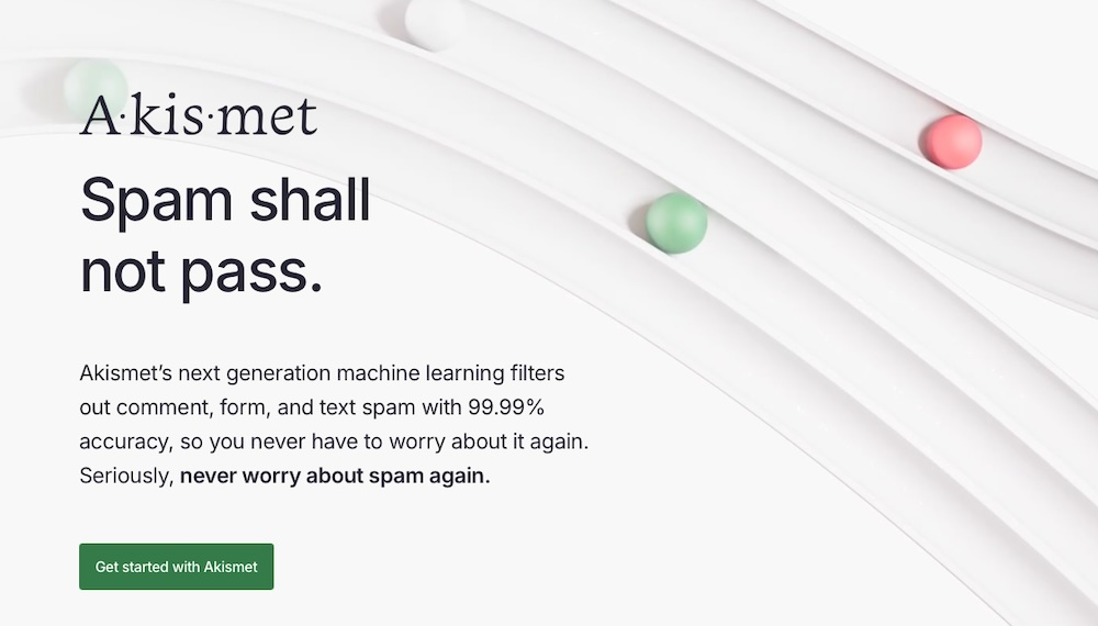
Better yet, use a strong anti-spam plugin that works in the background. Anti-spam solutions like Akismet handle spam detection quietly and reliably without requiring extra steps from visitors.
Aim to stop fake entries, not discourage real ones.
18. Track form analytics
After publishing your form, monitor who interacts with it to discover ways to improve upon the process.
Jetpack Stats tracks page visits and submission events. You can see how many people land on the form page and complete it, giving you a baseline understanding.
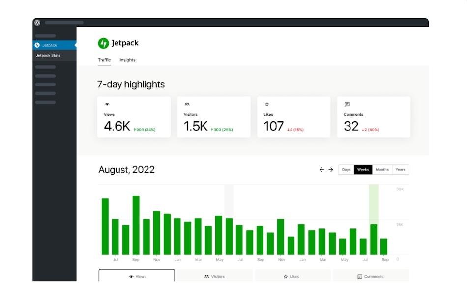
For deeper insights, like where people drop off, which fields they leave blank, and how long they spend on the form, add tools like Google Tag Manager or Hotjar.
Even small changes like rewording a confusing field or removing a low-value question make a big difference.
19. Enable real-time field validation
Mistakes happen, but catching them early helps people complete the form without frustration.
With real-time validation, the form checks each field as the user types. If there’s a problem, like a missing “@” in an email address, the form shows a quick note. This helps people fix errors faster and finish the form without starting over.
It also cuts down on failed submissions and support requests. When forms give clear feedback in real time, they feel smoother to fill out.
20. Use auto-responders or confirmation emails
After someone submits your form, don’t leave them guessing. Send a quick email to confirm you got their message.
An auto-responder lets the prospect know the form went through and tells them what to expect next. Also, include helpful links or contact details in case they need to follow up.
This kind of message offers another way to build trust. It shows you’re paying attention and sets the tone for clear communication going forward. It also reduces repeat submissions from people who weren’t sure their first one worked.
21. Prioritize fast load times
A slow form costs you leads. Review your form plugin to make sure it doesn’t load unnecessary scripts or large files. Then, compress and optimize nearby images to avoid extra delays.
Also, test the form on different devices and connections. Mobile users on slower networks tend to abandon forms that lag or stall. A fast-loading form improves the experience and removes one barrier to getting that conversion.
Jetpack helps lighten the load with performance tools like Jetpack Boost, which optimizes CSS and defers JavaScript across your site for faster rendering. Its image CDN delivers static files from servers close to your visitors, further speeding up page and form delivery.

22. Regularly test and update forms
Forms require ongoing attention. Over time, plugins update, browser updates roll out, and your business needs change. What worked for your form last year may no longer perform well.
To remedy this, check your forms regularly. Look for broken fields, outdated questions, or missing integrations. Test them on different devices and browsers to make sure everything loads and works as expected.
Also, stay in touch with your team. If your sales or support staff say people are submitting the wrong info or getting stuck, that’s a sign the form needs an update. A little upkeep keeps your form useful and your responses strong.
Frequently asked questions
We’ve covered a lot, but if you have additional questions, the following should help:
What are common mistakes to avoid when designing a contact form?
The most common contact form mistakes relate to poor design choices that frustrate users. These include things like asking for too many details, not indicating which fields are required, using confusing labels, or placing the form in a hard-to-find spot. Encountering form errors also discourages conversions.
How many fields should a contact form have for best results?
Most forms do well with three to five fields. That’s enough to collect basic info and give visitors a fast way to reach out. Ask more questions later by email or phone. If you really need more information upfront, make some of the fields optional or break them into steps. The shorter and cleaner the form looks, the better your chances of getting a response.
Can long contact forms reduce conversion rates?
Yes, long forms feel like work. People might start to fill them out but stop when they see how much is left. Each extra field adds friction, even more so on mobile. Some won’t feel comfortable sharing too much before they know you. Simply, when a form looks short, it feels faster to complete.
What’s the ideal placement for a contact form on a website?
Put the form where it’s easy to find without scrolling too far. This often means near the top of a landing page or at the end of a section that explains a service. Including a form again lower on the page so visitors see it once they’ve read more works, too.
What are the most important fields to include in a contact form?
The most important fields to include in a contact form cover the basics. You’ll usually need a name, an email address, and a message box. If your team needs more context, a dropdown to ask about the reason for contact can help. Try not to ask for things like a phone number or company name unless they’re essential. Every field should have a clear reason for being there.
How can I reduce contact form abandonment?
Keep your form short, clear, and simple. Show people which fields are required. Give instant feedback when something’s missing or entered wrong. Make sure it works well on mobile devices. Also, use plain language and short instructions so people don’t have to guess. Even small changes, like clearer labels or simpler questions, can help more people finish the form.
Why is it important to validate contact form fields in real time?
Validating contact form fields in real time gives people a chance to fix a mistake immediately. If such an error appears only at the end, you’ll likely frustrate people.
What are best practices for contact form call-to-action buttons?
Use short text for call-to-action buttons. Instead of saying “Submit,” tell people what will happen next, like “Send your message” or “Get your quote.” The wording should match what the person expects. A clear CTA sets the tone and builds confidence. It also helps the form feel more personal.
How can I prevent spam through my website’s contact form?
Spam bots target forms that don’t have protection. You can stop most of them with a good anti-spam plugin. One of the most trusted options is Akismet, which works in the background and doesn’t rely on intrusive tools like CAPTCHAs to prevent spam.
What is a free and easy-to-use contact form solution for WordPress?
If you run a WordPress site, Jetpack Forms is a simple way to build and manage forms without code. It’s included with the Jetpack plugin and lets you create clean, mobile-friendly forms within the block editor. It integrates seamlessly with Akismet for spam protection and even has built-in AI support through Jetpack AI Assistant, which enables you to improve forms or draft responses faster.
