As we’ve been busy adding blocks and functionality to the mobile editor in the Jetpack mobile app, the fundamental design was overdue some love. We’ve started a refresh with modern styles, streamlined writing, and closer alignment to the experience on the web.
Let’s take a look at the changes coming to you with version 22.9 on iOS and Android.
Fresh styles and colors
We’ve banished the blues for a bolder black and white design. There’s higher contrast and legibility, and more familiarity with what you see on the web.
The top navigation bar is tidied up and adds a border to separate your content. We’ve replaced your site title with your site icon, which navigates back to your site. We used the extra space to surface undo/redo at the top.

Media shortcuts
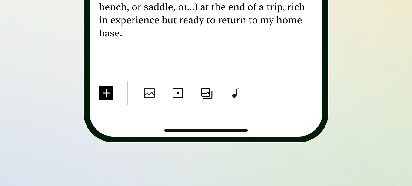
When you have no block selected, we added icons to quickly add an image or video without opening the full block list.

Streamlined writing and a Unified Toolbar
Writing felt clunky with a border and controls surrounding your text.

We’ve removed the blue box to give your words space to breathe. Those actions all moved to the toolbar, so any action you need to take on a block can be found in one place.

The settings icon moves to the start of the toolbar, while the arrows to move blocks up and down are at the end. And even better, you can drag and drop blocks directly.

More to come
Stay tuned: we’ve got exciting things lined up for the mobile editor experience. Any feedback you have is welcome to help us continue to improve the Jetpack mobile app.
Don’t have the Jetpack mobile app yet? Download it today!

Please add monthly and yearly post section as well as poll, survey, quiz etc
LikeLike